Congratulations! You have taken the leap and decided to start your own business.
Now that you have the perfect name picked out, you’re set with the challenge of choosing the best logo for your brand.
Or, maybe you’re an established business looking to rebrand an outdated logo for a fresher look.
Regardless of which scenario you find yourself in, you’re probably asking yourself some key questions.
- What makes a good logo design? ?
- What are the best colors and shapes to use? ?
- How will the logo impact my business? ?
- How do I choose the right logo? ?
Don’t rely on best guesses and assumptions to answer these questions. Instead, use fact-based evidence and customer feedback to achieve data-driven decision-making.
Our market research company, Drive Research shares how in this blog post.
What is a Business Logo?
Before we dive in, let’s take a step back. What is a logo?
According to Brandfolder.com, a logo is “a group of letters and/or symbols used in a consistent and unique way to identify a company, brand, product, or service.”
A good logo is important for businesses because it is part of what makes a brand stand out. It helps to make an organization more memorable and identifiable, both of which help improve brand loyalty.
In fact, 50% of consumers are more likely to purchase from a brand with a logo that they recognize.
Therefore, using data to determine the best logo color, typography, and design will go a long way in producing more sales for your business in the long run.
What Makes a Good Logo Design?
Now that we have the clinical definition of a logo, Brandfolder has identified 5 aspects that make a good logo design.
1. Usage
When choosing the best logo for your business, first consider how you will use it, as usage is very important.
For instance, logos that will be used on websites or printed on items such as stationery and business cards are designed differently.
Keep in mind the more uses you intend for your logo; the more design costs will increase. Deciding how, and when to use your logo now will help you in the future.
2. Image style
Since the logo will represent your company, brand, and/or products, you will need to choose a design that implies what kind of business you have.
The logo should ideally make it simple to identify your company, as well as easy to recall for potential customers.
The style you end up choosing should also capture the essence of your company’s culture and philosophy.
3. Appeal
With 60% of consumers avoiding brands that have odd, unattractive, or unappealing logos, regardless if they received good reviews – an appealing logo is extremely important.
Therefore, once you’ve decided on your top selections, make absolutely sure your target audience is also happy with the logo (more on how to accomplish this below).
The logo, like your business, should be able to stand the test of time. This includes choosing the right colors, shape(s), and text.
4. Originality
Choosing the best logo is key when it comes to branding, as it is essentially considered the face of your business.
Be sure your logo is unique and do your best to ensure it stands out. It should be impressionable, yet unlike any competitors.
5. Format
File format goes back to the first point of usage. The file format is important, as it matters if the logo can be edited on both PC and MAC software.
While PDFs are widely universal, other formats such as GIFs, JPEGs, BMPs, and TIFs are all different when it comes to color storage, the digital display uses, and different resolutions.
Be sure to work with your designer to ensure that you’re getting the correct formats for the intended uses.
Different Types of Logos
Now that we’ve identified 5 aspects that make a good logo design, you will have to then decide what type of logo is needed to fit your business.
99designs.com has offered a list of 7 main types of logos to help with your selection.
1. Lettermarks
Great for streamlining your logo, lettermark logos make great use of initials, especially for those companies that have long names.
Also known as monogram logos, these are a safe bet if you want to take the minimalist route.
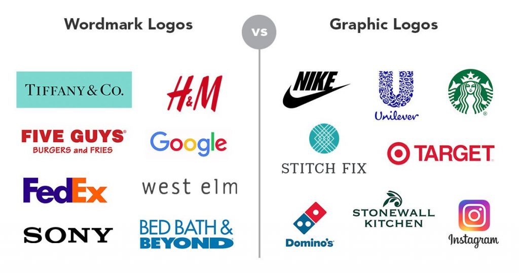
2. Wordmarks
Also referred to as logotypes, this is a direct way to bring your company name to life.
This can be accomplished by visualizing your company’s name through a creative font arrangement, also called typography.
3. Graphic (logo symbols)
Perhaps what most people associate with logos, are graphical images that are easy to recognize and remember.

4. Abstract logo marks
Somewhat like logo symbols, abstract logo marks make use of creative geometric shapes and designs instead of using a traditional image.
These could be best used for truly unique businesses or those that want a futuristic look and feel.
5. Mascot logos
These are usually used to give brands life or personality.
In most cases, these logos are in the form of cartoon-like characters that make your business more appealing from a family-friendly point of view.
6. Combination mark
As the name implies, this logo combines a symbol with a wordmark to make the image more impactful, or easier to recognize.
7. Emblem
If you’re looking for a traditional or established look, an emblem may be the way to go when choosing the best logo.
Emblems make use of both word and picture elements and can be incorporated with shapes such as shields or crests.
Psychology Behind Logo Color
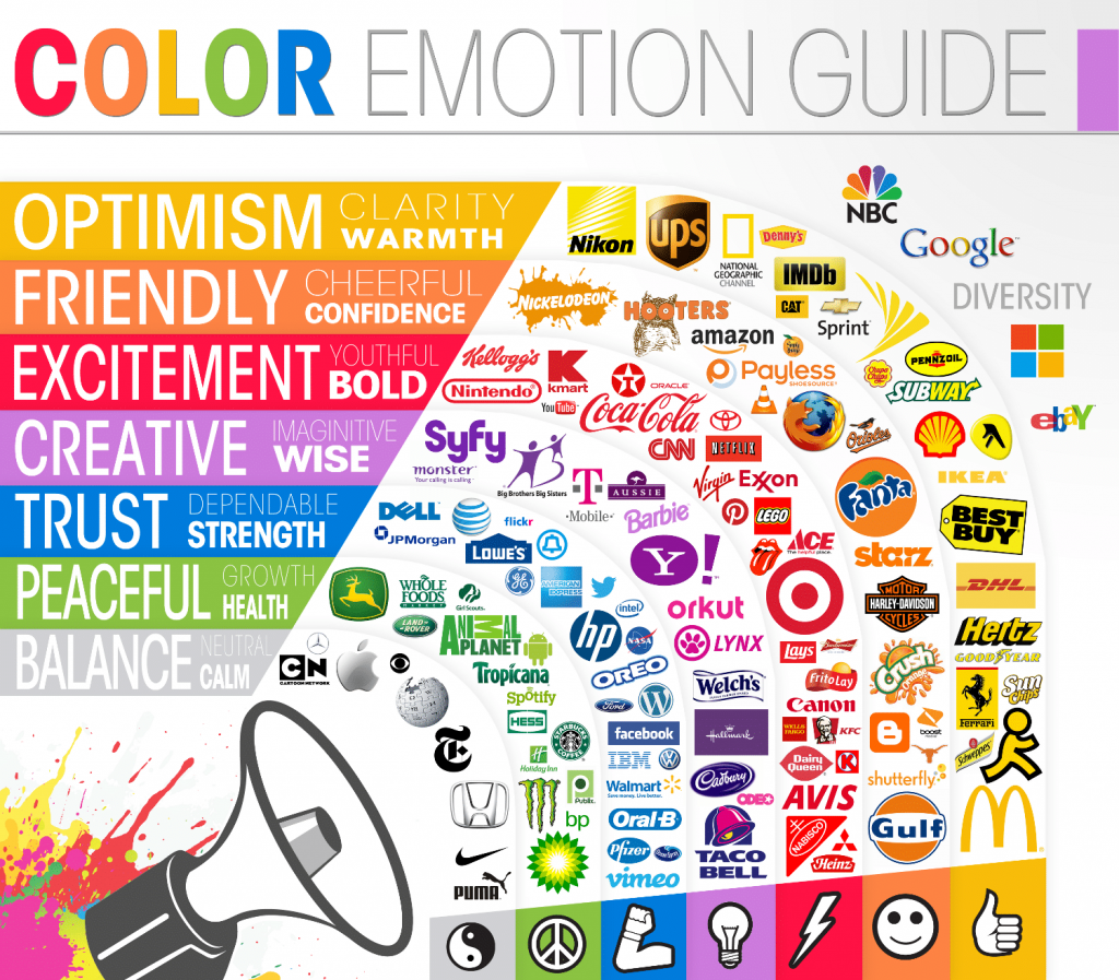
It’s also important to recognize the scientific aspects of logo design. For example, colors matter.
The psychology behind the logo color is both apparent and complex – but in summary, colors have emotions and behaviors attached to them.
Let’s take a brief look at the main ones represented on the color wheel.
- Red: Stands for urgency, excitement, passion, and anger. This is best used if you have a loud brand and want to stand out.
- Orange: Vibrant and energetic. It’s a good playful color for youthful or busy brands.
- Yellow: This color implies accessibility and helpfulness. It gives off safe energy.
- Green: A safe color, green is versatile across many different shades. It’s associated with nature, intelligence – and of course, money.
- Blue: Classic and cool, blue is a stable color. It can mean calm and maturity, as well as stability and trustworthiness.
- Purple: A somewhat mysterious and maybe underused choice, purple can be linked to luxury. It may be best used for feminine-type brands.
- Pink: More feminine than purple, pink is the quintessential “girly” color. Pink can also help your logo have a mature and cool look yet be youthful at the same time.
- Brown: Another underused color, brown is about being rugged and “manly.” Used appropriately, this can give your brand a vintage, aged look.
- White: Perhaps the most neutral color, white is clean and modern. You can pair it with other colors without going over the top.
- Black: Fairly common, black is also minimalist. It’s modern and luxurious and is often paired with other colors – especially white – which will keep your brand clean and contemporary.
- Gray: Another neutral color, gray exudes class and maturity. It’s another color that is paired with others without being too much to handle.

Image Source: The Logo Company
Psychology Behind Logo Shape
Shapes are also important and need to be seriously considered in choosing the best logo design.
Shapes are generalized into two categories: circular and angular. And each form carries different connotations for your business.
Circular shapes are seen as:
- Soft and gentle
- Grace and beauty
- Caring or kind
- Associated with conflict resolution or compromise
Angular shapes are seen as:
- Hard
- Complex
- Exciting
- Associated more with confrontational conflict resolution
While neither shape isn’t necessarily better than the other, each one carries a meaning. Make sure the shape fits your brand mission.
Choosing the Best Logo with Data
You’ve made it this far. By now you’ve considered the aspects and the science behind creating a good logo.
It’s also likely you’ve developed more than one version, and now you need to choose the best one.
This is where our market research company is here to help.
The team at Drive Research will use consumer feedback and data to test your logo and deliver the results. This may include doing qualitative, quantitative, or a hybrid research approach.
While there is a distinct difference between qualitative and quantitative research, both are excellent tools for choosing the best logo for your business.
Choosing a logo with qualitative research
Qualitative research is meant to explore, more specifically, thoughts, behaviors, attitudes, and feelings toward a subject. The scope for logo research is likely to be conducted in one of two ways.
1. Focus groups
Led by a moderator, focus groups normally consist of 4 to 12 participants that come together to engage in discussion around the subject, either in-person or online.
The moderator will ask questions and have the group complete tasks, from which insights and conclusions can be discovered.
In this case, the moderator may ask the group to compare differences between 2 or more logos.
This could also include deeper discussions around the size, shape, color, or impact of the logo – or which logo(s) are better than the other(s).

Focus group facility at Drive Research
2. In-depth interviews
Also known as IDIs these are 1-on-1 discussions between a participant or moderator, which can take place either in-person or online.
Since IDIs take place in a smaller setting, the moderator is allowed to go deeper with questioning.
A huge benefit of IDIs is that the individual taking part is less likely to have bias associated with the group, which then allows more detailed feedback around thoughts and feelings of the logo(s).
Recommended Reading: Qualitative Battle – Focus Groups vs. In-Depth Interviews
Choosing a logo with quantitative research
Quantitative research is meant to measure, more specifically, the focus is on benchmarking or gathering quantifiable statistics that can be measured.
While there are many forms of quantitative research, the methodologies below are most suited for choosing the best logo design.
1. Concept testing surveys
Perhaps the most common way the quantitative methodology is executed is through concept testing surveys.
In this case, the respondent will is asked a standardized set of questions through a survey that can be taken on a web browser through a computer, phone, or another device.
Types of questions can include rating scales or choosing the best answer out of a list.
Once enough respondents have taken the survey to test branding, the results can be counted up or quantified – then analyzed for trends, similarities, differences, etc.
2. Intercept surveys
Usually in person at a site or an event, intercept surveys are administered one-on-one.
The respondent will answer a list of scripted questions, which are often completed on paper, or a small electronic device such as a tablet.
The benefit of intercept surveys is the process of administering the survey as well as collecting feedback is done in the moment.
In terms of testing a logo, this is done at a home show, sporting event, shopping mall, or other such areas that see high foot traffic.
Choosing a logo with hybrid market research
A hybrid research method can also be used to help you choose the right logo. In this case, element(s) from each of the qualitative and quantitative methodologies will be executed.
Here is a possible scenario.
You have decided to have 3 different logos tested among a focus group.
By the end of the session, we find that 2 of the logos tested similarly, while the third logo was eliminated. Now you want to gather additional feedback for the 2 logos the group selected.
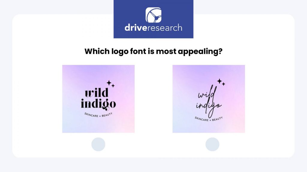
The next step is to send out an online survey where respondents are asked to A-B test, or select the elements they like the best from a list provided to them.
Once the survey receives enough respondents, the answers are tabulated or quantified – which then provides data that can be used to make an informed decision on choosing the best logo.

Example of Using Customer Feedback to Choose a Logo
Besides color, the science behind descriptions and shapes also matters. Crowdspring.com has offered insight into both elements:
Scenario: You are presented with 2 logo choices to consider.
- The first logo has a business name lettered inside a colored circle.
- The second logo has a unique, custom shape that describes what your business does, and it has the name underneath.
Which one do you choose?
According to a recent study, most people will choose the second one. The differences are the first logo is non-descriptive, whereas the second one is descriptive.
Research has uncovered that descriptive logos are more visually appealing, and easier to process than non-descriptive ones.
The research also shows that descriptive logos make brands appear more real and authentic. As a result, it increases customers’ willingness to consider the brand and ultimately make a purchase.
Contact Drive Research to Choose the Best Logo
Drive Research is a market research company with experts that can execute the best methodology to help you choose which logo to use. Delivering key insights and actionable recommendations is at the heart of what we do.
Are you interested in learning more about our market research services? Reach out today.


